How to Paint with Pantone's 2022 Color of the Year
Pantone has chosen the 2022 color of the year, Very Peri or Pantone 17-3938. This lively periwinkle blue hue with an energizing violet-red undertone is said to symbolize the transition the world is in right now.
Although it carries complex connotations, Pantone’s Very Peri is meant to open up our sense of possibilities and invite us to rewrite our lives. Use this periwinkle color to help spark confidence and daring curiosity to awaken your creative spirit.
Tips for Using Very Peri in a Residential Setting
If you're ready to paint your home with the trend-setting Very Peri, check out these painting tips:
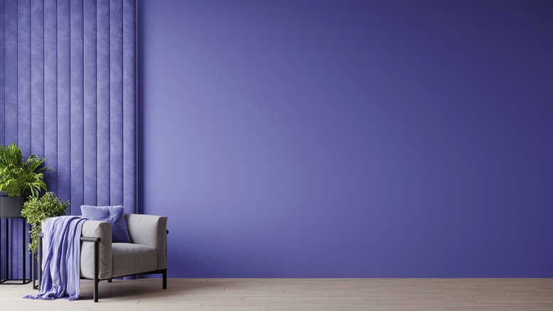
1. Go Light on Walls
With its light yet moody vibe, periwinkle is a subtle color that can work well in all kinds of settings. Best for bedrooms and dining rooms, it makes these spaces feel more elegant and larger than they are. To make Pantone’s Very Peri pop, try incorporating it into a pattern or using it for an accent wall.
2. Accentuate Details
If you're wanting to incorporate this periwinkle hue into your interior, but don’t want the whole space to be painted in this color, try adding statement décor pieces or paint small sections to accentuate details. This will give each area a more visual impact, creating a beautiful, cohesive space.
3. Combine Colors
Using different shades and tones of color can really make your interior shine. Try combining Very Peri with any other similar hue on your walls to give the space more depth.
How to Effectively Use Very Peri in a Commercial Setting
Besides making your home look great, Very Peri can also be an excellent color choice for your commercial building interior if used correctly. Check out these commercial painting tips:
1. Add Hints Through Décor
In order to maintain a professional appearance while still creating a colorful, energizing office interior, try adding décor pieces throughout in this periwinkle hue. This will help your office stand out without overwhelming the space.
2. Maintain Consistency from Room to Room
While there are many ways to tie together different office rooms through theme and design, the most effective one is by using colors from your chosen palette across each space. Create a harmonious brand identity by combining Very Peri with other colors from your palette.
Contact Our Painting Experts
At Major Painting, we can help you incorporate Pantone’s Very Peri throughout your commercial or residential building to create an attractive, energizing space. For more paint color tips, or to learn more about our commercial or residential painting services, contact us today!
